
GIS Mapping: Types Of Interactive Maps & Applications
Today, monitoring change, making informed decisions, and discovering geospatial trends without using GIS map data is simply not feasible. A GIS map is an indispensable tool when it comes to representing geophysical data about the world on the screen in a dynamic and interactive way. Depending on the problem that needs to be solved, there exists a variety of types of mapping in GIS, ranging from category maps to bubble maps to heat maps.
What Is GIS Mapping?
GIS stands for geographic information system and the map is, of course, a visual representation of quantifiable data. Compared to traditional table maps, a GIS map is dynamic and interactive. It can reveal previously unseen features by highlighting them and show change of these features over time, based on the given attributes.
GIS Map: How Does It Work?
Since human eyes are wired to respond to different colors and shapes, a GIS map usually transforms real-world geospatial data into colored patterns or shapes. This speeds up processing of information, which leads to faster and better-informed decisions.
As far as the purely technical side of GIS mapping goes, the system ties a geospatial point containing latitude and longitude to a specific data element. Then a spatial analysis measures the distance between these points and determines the relationship between them, to better understand the planet.
Using this technology, geographers and other GIS professionals can visualize various kinds of statistics, including client base distribution and demand for a product or service, demographic facts, and other data.
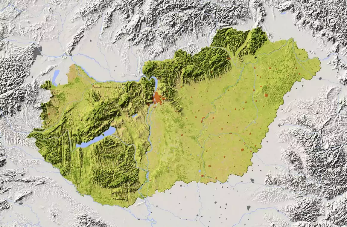
Types Of Mapping In GIS
Depending on what exactly needs to be visualized, there are many different types of mapping in GIS. It can be anything from population density to crop classification. Some of the most common types of GIS maps are: category, heat, cluster, bubble, and quantity ones.
Category Maps
When you need to understand exactly which portions on the map correspond to which data segment, there is nothing else like a category GIS map. This is by far one of the most common types of GIS mapping, since it is the easiest to create. A specific category, or attribute, is assigned its own distinct color. The result is a convenient map of differently colored patches, each representing a particular category.
Heat Maps
Often mistakenly applied to quantity maps, the term “GIS heat map” actually describes a unique mapping convention. When the data you need to represent on the map is incredibly dense and mixed up, a general idea of “warmer” and “cooler” regions can help. Especially, if you know that the hottest spots represent the highest density of the given quantity.
It is more or less universally accepted that red stands for heat, while blue means cold. Not that it is incredibly precise, but it definitely provides a rough picture of quantity distribution.
Cluster Maps
This type successfully combines the use of colors, shapes, and labels to cluster densely packed points of data together. In other words, there are too many points to be displayed individually on the GIS map, so they are fused into a single cluster point for convenience.
Bubble Maps
A bubble GIS map is an example of using shapes and the difference in their size to simplify the layout of complex numerical data. For example, imagine you need to compare the amount of people using certain slang words for different locations. Bigger and smaller bubbles on the GIS map will represent more and less people, respectively. Instead of boring rows and columns of numbers, you get bubbles. This provides a quick general understanding of the relationship between quantities and locations at a glance, saving time and effort.
Quantity Maps
A GIS quantity map is color-coded, but uses different shades of the same color to show the variety in quantities of something depicted on the map. It is a perfect GIS mapping solution to the problem of visualizing a lot of detailed data spread over a large area.
What Is A GIS Map Layer
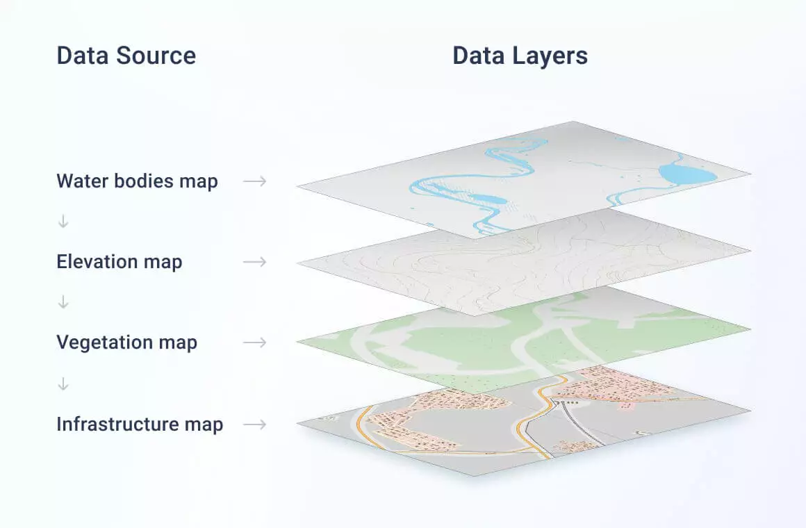
The magic of GIS map layers is that they allow for stacking different types of maps on top of each other on the same screen. This way different layers can intersect and synergize, providing much more information. The user can easily toggle between different layers, without confusing them.
The most basic layer is the so-called GIS base map. Most are familiar with the classic real-time satellite view base map. Yet, depending on the specific purpose, any type of data can be used as a base map to build other layers upon it.
Interactive GIS Mapping
Today, we take most online maps for granted, without stopping and wondering how incredibly interactive they are. A traditional map can be well-crafted, but it lacks dynamics and is limited in space and time, acting as a still photo. It simply doesn’t compare to, say, a Google Map, where you can:
- drag the map to any location;
- zoom in down to a single house;
- zoom out to see the whole world at once;
- switch between layers (political, physical, street view);
- click on different objects to learn what they are (identify them);
An average interactive GIS map has more to it than meets the eye. It can provide additional nuanced, relevant, and precise data to the user. Let’s take a closer look at the most interesting GIS mapping system interactive tools.
Map Queries
Many GIS map systems have a query feature, which is basically a data filter. It shows which parts/regions on the map within a certain AOI (area of interest) share a common quality or represent the same quantity. A query is made by typing/asking a question, letting the system know which features to highlight.
AOI-Specific Information
If the GIS interactive map of the world seems too vast and confusing, it’s a good idea to narrow the scope down by defining a specific AOI. For example, you can draw contours on the map, enclosing the area of interest within. Another way is to input specific attributes, so the system outlines AOI automatically. One way or another, working with a defined area on the map is very convenient.
Measuring And Distance Tools
Remember how you had to put a ruler on the map to measure a distance between two points and would strain your eyes to make out the little marks on the ruler to achieve precision? If you do, it’s time to forget. A good GIS mapping software will have an interactive set of measuring and distance tools at your fingertips.
Through Layers Search
Switching between layers may be fun, but sometimes there is no time for fun. Sometimes, it’s faster to search for the specific attributes or values of interest. A well-designed GIS map system is equipped with a through-layers-search tool, automatically showing you the layer containing the data you’re looking for.
Printing GIS Maps
Yes, even a GIS map has to be printed out once in a while, to provide users with a hard copy in a PDF or some other format. This is, however, most likely destined to become an obsolete feature, since most GIS map systems are getting increasingly more accessible to users via web applications.
Is There More?
Of course, the GIS map systems are not limited to the cool interactive features listed above. Mapping tools can always be customized to specific niches to solve highly specific problems. In that sense, interactive GIS mapping has a truly wide range of applications, and the technology keeps evolving.
GIS Mapping Software: Basic Components
As mentioned above, GIS tools for mapping vary according to the niche and the type of problem that needs to be solved. However, all of them should have three basic components:
- Legend
- Info Window
- Toolbar
Here is why a good GIS mapping software must have all three.
Legend
At a glance, any GIS map is interesting to look at, with all the different colors, shades, and shapes of various sizes. Visually it’s very appealing, but how to make sense of it all on a verbal level? This is why all GIS mapping services should have a legend listing all the attributes displayed on the map, be it numbers or words, along with their corresponding visual representations, such as symbols and class breaks.
Info Window
There are times when legend is simply not enough to fully understand the map content. Once again, the interactivity of GIS tools for mapping proves to be a huge benefit compared to regular maps: a simple click on any item on the map brings up specific information about it in a pop-up window.
Toolbar
The last but not least, a toolbar provides users with access to various interactive GIS mapping tools, such as zoom-in, zoom-out, search, and others.
GIS Mapping In Practice
Decision-makers rely on relevant and definitive data. A GIS mapping software can visualize crucial data in the clearest way possible, providing users with the insights they need to solve problems. A GIS map can show locations, quantities, density, identify objects within AOI, even monitor change, and many more.
How I Wonder Where You Are
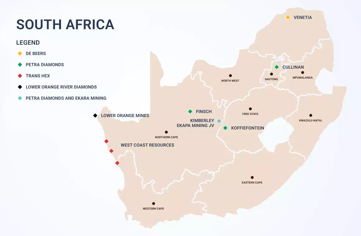
Probably the most simple use to think of for a GIS map is to highlight specific features as points to show where exactly they are located. By looking at the distribution of certain objects on the map, a human eye can detect certain patterns or trends, which can help better understand the data dynamics. For example, this GIS map shows where different types of diamonds are mined in the South African Republic, by giving each type a distinct color. Mining is one of many industries that highly benefit from the use of GIS technology.
How Much Is There of Something
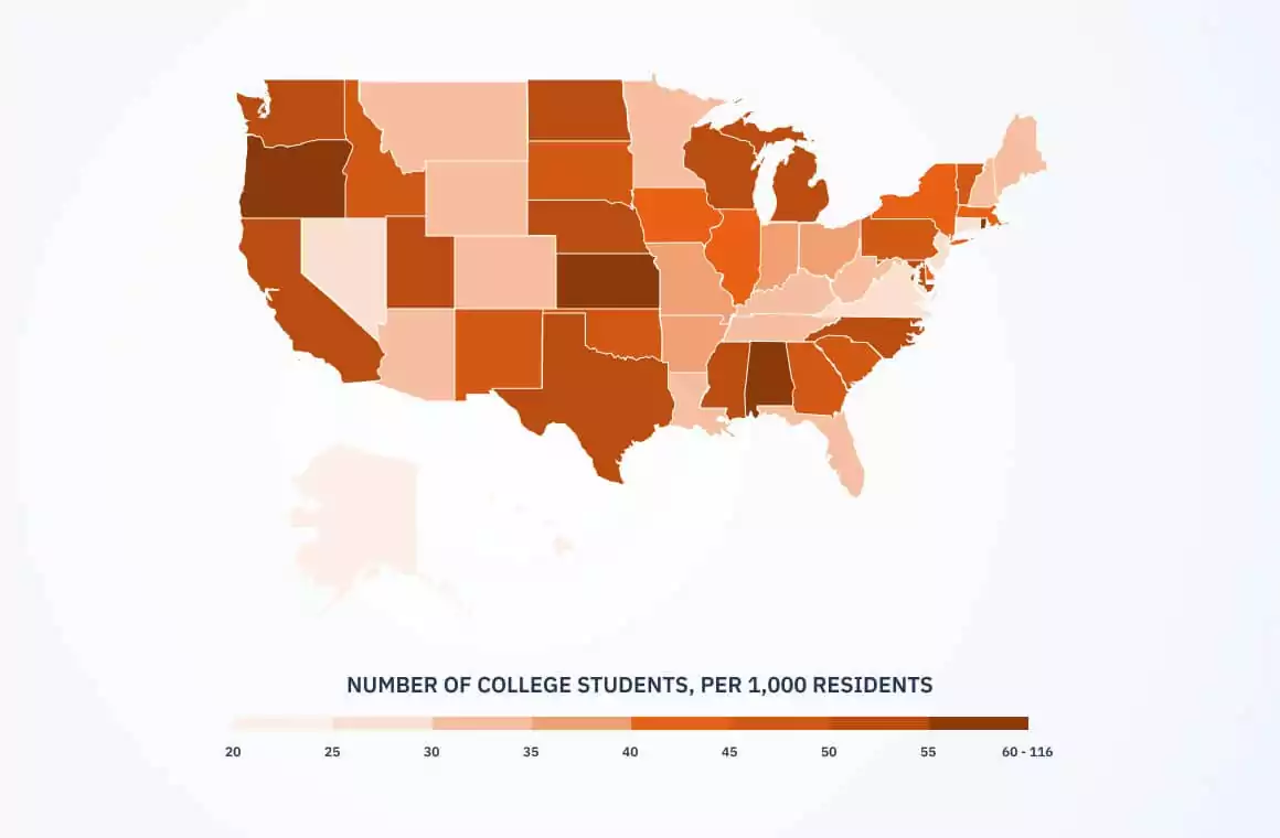
Statistical and numerical data usually come in big tables and spreadsheets that can be really intimidating. Visualizing them as colors, shades, and appealing shapes on the GIS map can simplify things and improve the decision-making process. A map below compares the number of college students between different states. It is essentially a quantity map, using shades of brown, darker ones representing a higher value.
It Is Our Density
The more data there is to process, the more confusing it can be to understand it. Sometimes, a general display of more and less dense distribution of people, objects, or other attributes, on a GIS map can be enough to make sense of it. Real-estate agencies often use heat maps to analyze the distribution of prices, income, and other data over a large territory.
There Is Something In There
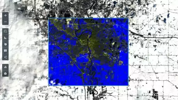
After defining an AOI, a GIS mapping software can detect individual items within the area. For example, a hurricane’s path can be outlined on the map as an AOI. The next logical step is to identify objects on the GIS map that were unfortunate to end up in the hurricane’s way. If they are within the AOI, they could have been affected.
Near, Far, Wherever You Are
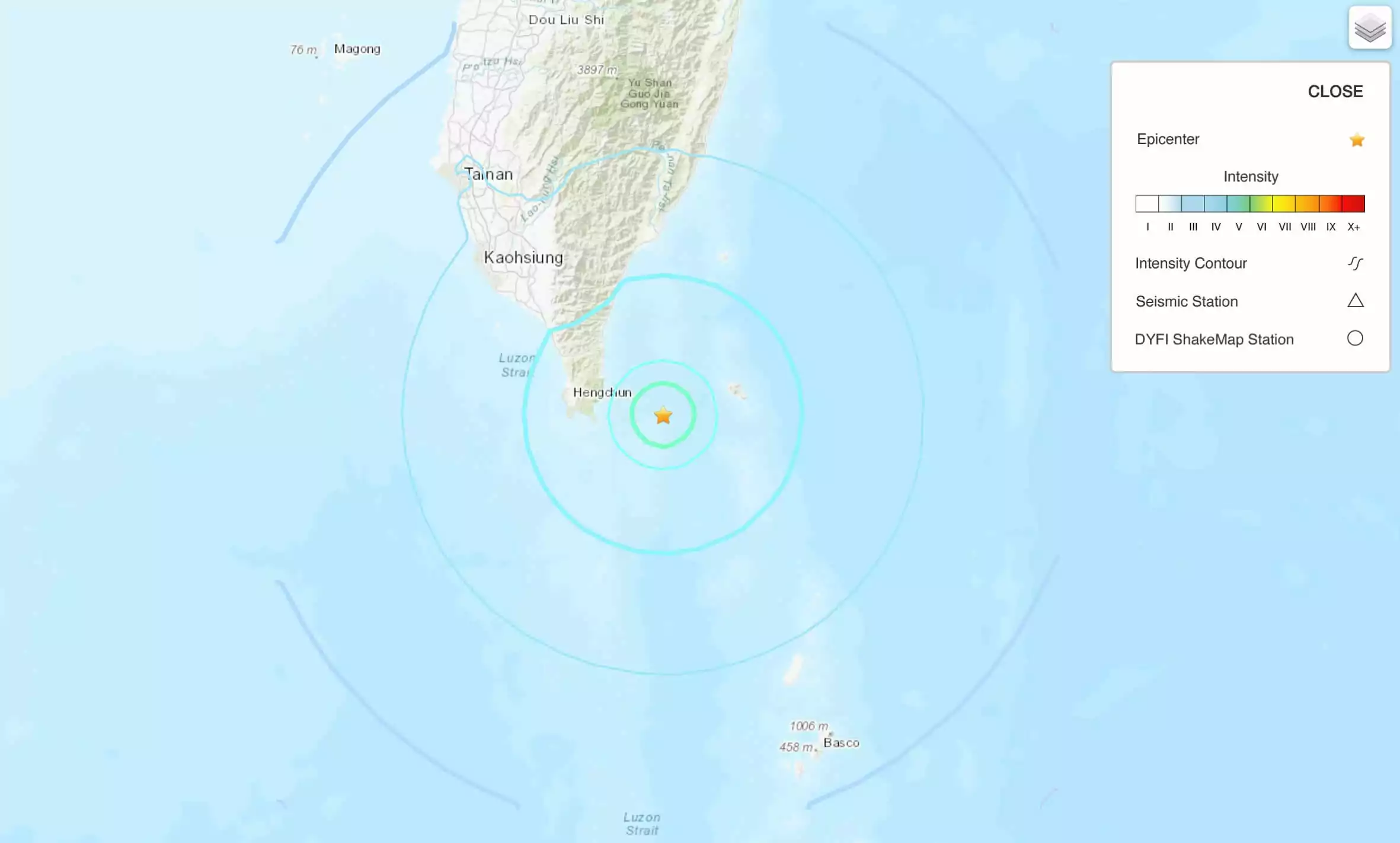
GIS tools for mapping can discover the relationship between a given point on the map and an area within a certain distance from it. Measuring the impact of the earthquake happened 47 km away from Hengchun Township, Taiwan is a good example determining the relationship between different locations. The closer to the epicenter, the higher the magnitude and the higher damage on the territory.
Change Detected
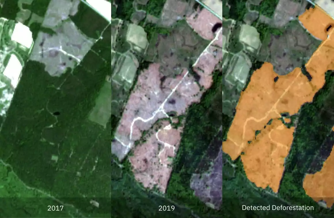
Things do change, but we can monitor the dynamics of change using GIS mapping services. Comparing images from different dates using a time-series method, you can discover trends and make better-informed decisions. It works well in forestry, for instance, when there is a need to monitor deforestation. EOSDA LandViewer presents satellite images of the area that has undergone deforestation. A series of change detection images represent the process.
GIS In Agriculture
It is now pretty hard to imagine a time when application of GIS in agriculture was not a thing. Modern farmers and growers simply cannot sustain steady food production without the use of GIS mapping services, along with the use of GPS, and smart ag machinery.
EOSDA LandViewer
Search for AOI-specific satellite imagery, apply custom band combinations and download for free.
There is an impressive number of remote sensing and GIS applications in agriculture of today:
- Identification and classification of different types of crops
- Visualization of the state of crops based on the vegetation index values
- Visualization of data collected by machinery
- The use of different layers on the same screen.
EOSDA Crop Monitoring is a platform that can do all of the above, integrating many different types of data to visualize them all conveniently on one screen using GIS mapping tools. It combines raster and vector data to provide growers with actionable insights, improving decision-making. Below are several examples of how GIS mapping services are implemented on EOSDA Crop Monitoring.
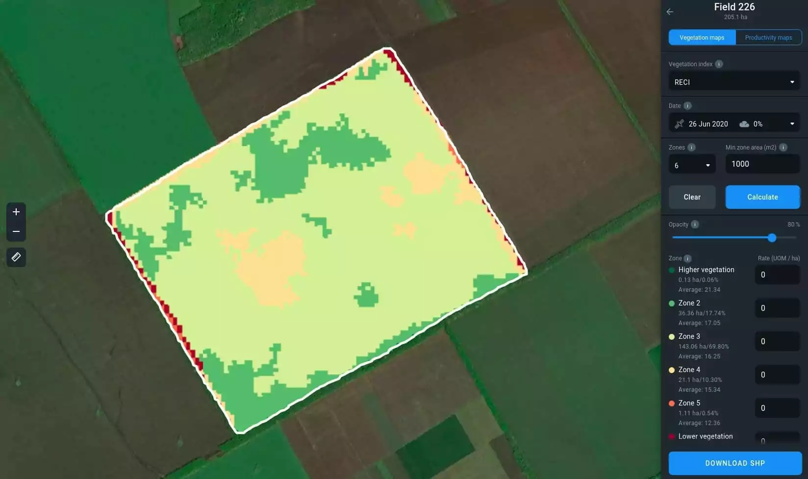
EOSDA Crop Monitoring uses heat maps to display the vegetation density, utilizing a saturated red to represent the lowest possible index value. The choice of red here is linked to a psychological phenomenon where the red color acts as an emotional stimulant and draws attention. There are several available indices, including NDVI, MSAVI, and ReCl, to give a fuller picture for monitoring crop health at every growth stage. The index maps can be downloaded in both raster and vector formats.
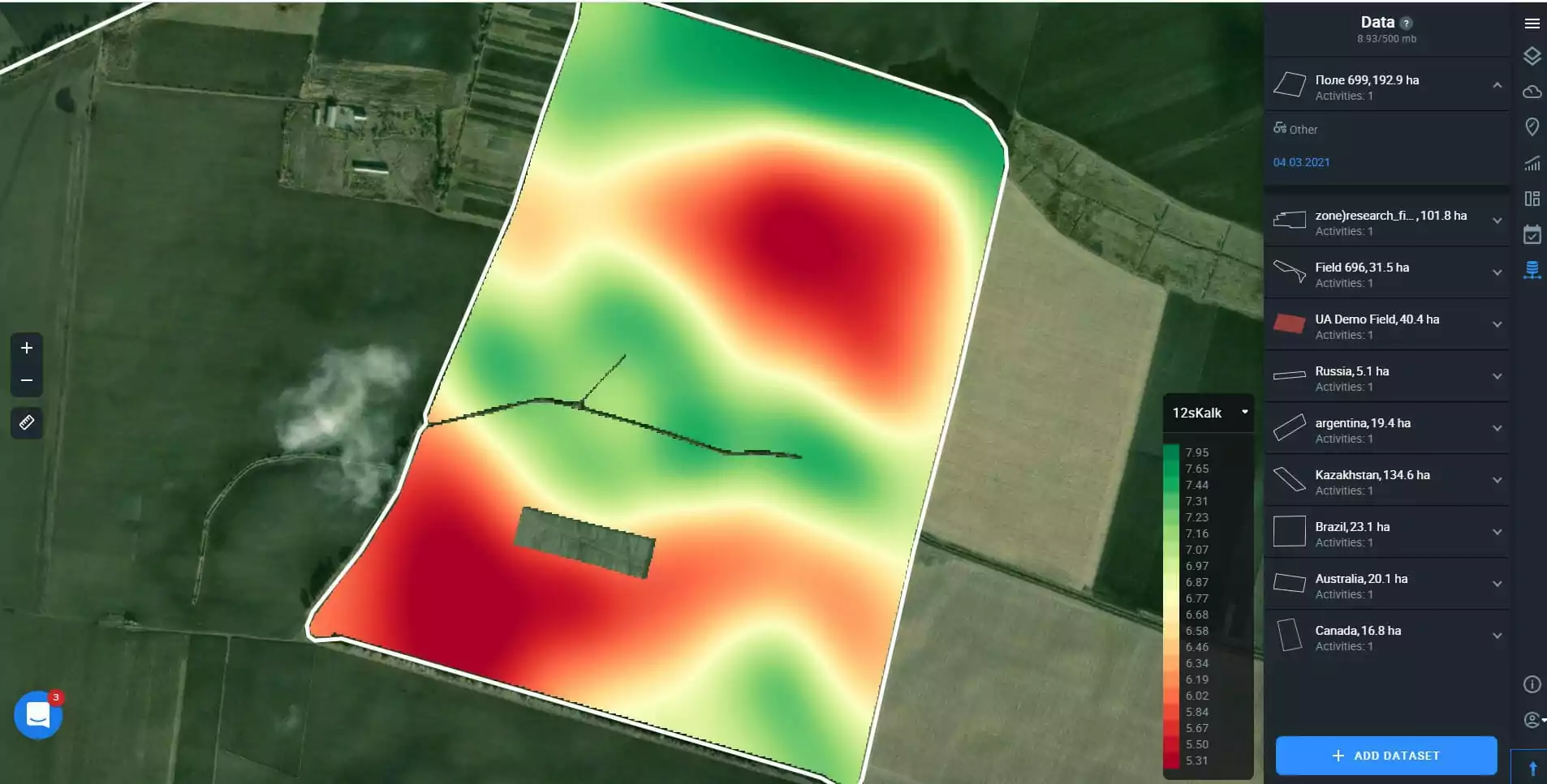
Another interesting feature is mapping data collected by the agricultural machinery. Users of EOSDA Crop Monitoring can import datasets to the software directly from the machinery, data like the density of seeding, field elevation, spraying, temperature of topsoil, and other. The differences in quantity and density are conveniently visualized on the screen as different types of GIS map.
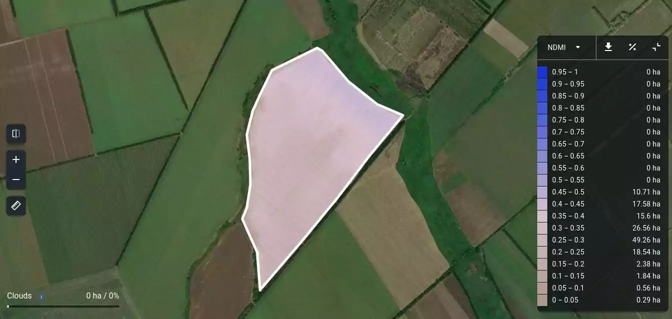
It is also possible to monitor change in moisture levels on EOSDA Crop Monitoring by looking at the heat maps with values of NDMI (Normalized Difference Moisture Index) ranging from darker to lighter blue. It allows farmers and growers to detect water stress at its onset.
GIS Mapping Is the Future
Actually, GIS mapping is already fully integrated into our day-to-day lives and work. From finding a location on the map to getting additional information about objects on the map, such as shops, restaurants, and recreation spots, to monitoring crops and mining fields; the uses are innumerable. GIS plays an essential role in agriculture, providing farmers and growers with crucial and timely data.
About the author:
Kateryna Sergieieva has a Ph.D. in information technologies and 15 years of experience in remote sensing. She is a Senior Scientist at EOSDA responsible for developing technologies for satellite monitoring and surface feature change detection. Kateryna is an author of over 60 scientific publications.
Recent articles
Can I See A Real-Time Live Satellite View Of My House?
Can you view live satellite images of your house? Discover how to find, preview, and buy high-resolution images of your property for planning or monitoring.
EOSDA advances rice field mapping in Indonesia with SAR
EOSDA tested a radar-based approach to improve rice field detection in Indonesia. By integrating SAR and optical data, the team ensured stable monitoring even during peak monsoon months.
From the Moon mission to practical Earth solutions
Space technology allows us to look further than ever before, but its value is twofold: as the NASA Moon mission explores new frontiers, we use that same vantage point to solve Earth problems.