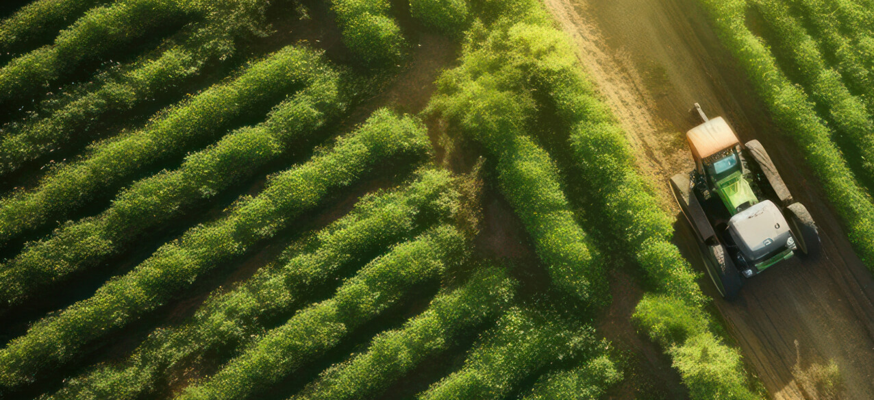
Manage Agricultural Risks. Receive Timely Notifications.
Monitor your fields remotely, get insights, and make smart decisions — all in one platform.
Crop Monitoring Platform For Remote Farm Risk Management
Identify problems and risks in the fields to make effective decisions
Simplify and speed up your precision crop analysis and vegetation health monitoring
Optimize resources and farm operations with our satellite-driven features
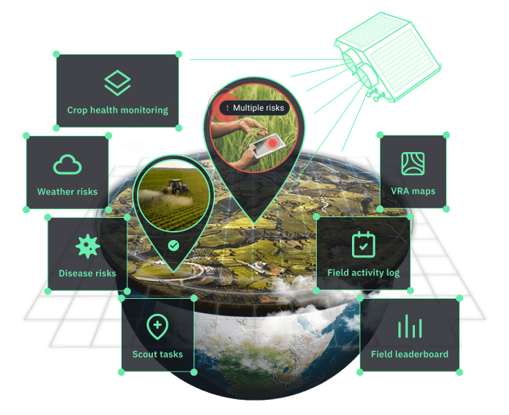
Ways To Make Your Farm Work Efficiently
Get Comprehensive Crop Analytics
We collect complex data from diverse sources and turn it into clear, simple insights just for you. Access farm analytics: history, weather, and vegetation data — all you need for smarter, faster farming decisions.
Monitor Crop Health Remotely With Satellite Images
Skip the field trips. Stay updated on plants' health and growth stages with fresh satellite images. Keep an eye on crop conditions, spot problem areas, track vegetation changes, and monitor soil moisture — all from your screen.
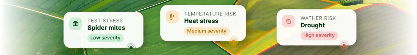
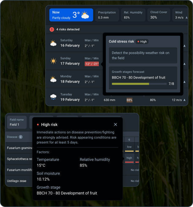
Get Notified About Risks
We'll inform you about any potential problems before they become major issues. Tackle vegetation health changes head-on and protect your yield.
Optimize Resource Usage
Why waste resources? Use Variable Rate Application (VRA) maps to save on fertilizers, water, seeds, and fuel. Spend less, harvest more.
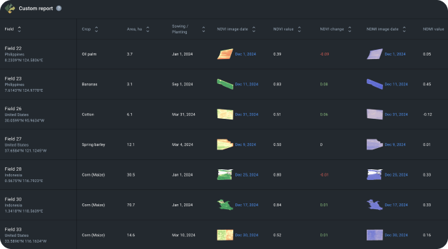
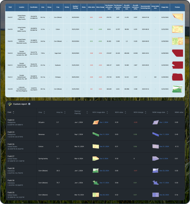
Сustomize Reports
Set up customizable reports to access field information in a clear and convenient table format. Create and share reports and insights with your team and stakeholders in a snap.
Simplify Farming In 6 Steps
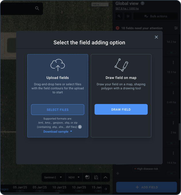
Add Your Fields
Upload a file with land plot boundaries or draw them. Add info about current and previous seasons.
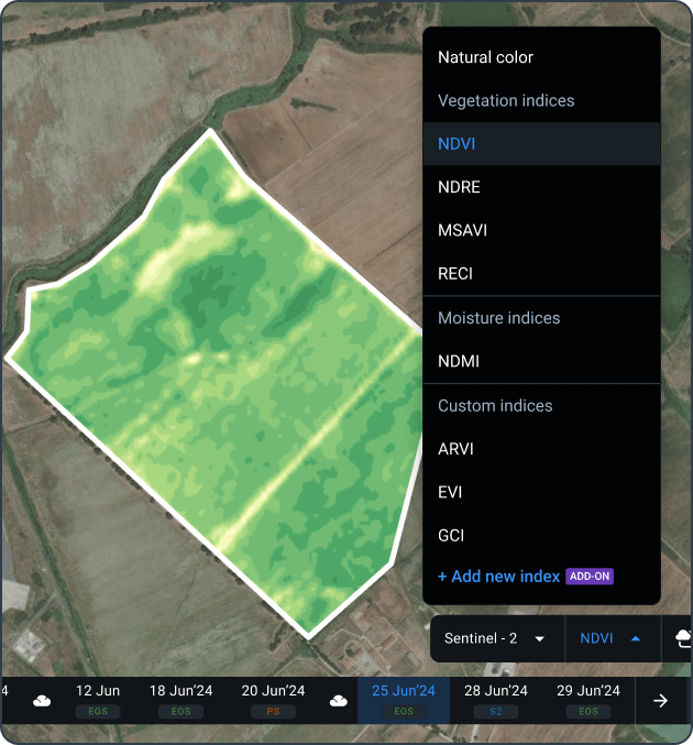
Access Satellite Data
Get the latest satellite images right when they capture your field. Use NDVI and other vegetation indices to see how your crops are doing and fix issues fast.
Analyze Trends
Dive into historical data on vegetation and weather. Spot patterns and use them to make smarter decisions next time.
Check Current Risks
Use all our tools to detect any risks to your plants during the growing season. Stay ahead of problems before they happen.
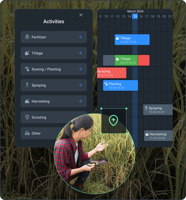
Take Action
Send scouts to the land plot or plan your field activities based on your monitoring and analysis. Track the outcomes and see the results of your decisions.
Share Data
Prepare a custom report for the current field state and share it with stakeholders.
Case Studies
The Morning Star’s Gradient Implements Remote Sensing
The Morning Star combines in-ground sensor data with satellite imagery analytics to ensure proper irrigation and increase tomato yields in California.
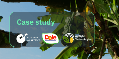
Dole Asia’s Leap Into AgTech With Agright Technologies
Agright Technologies assists Dole Sunshine in the Philippines in controlling fungi on banana plantations using satellite imagery analytics offered by EOSDA Crop Monitoring.
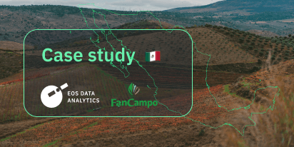
FANCAMPO Mexico Uses Remote Sensing For Crop Insurance
Agricultural insurance in Mexico rises to the next level with the FANCAMPO fund employing satellite imagery analytics through EOSDA Crop Monitoring for damage claims assessment.
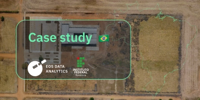
Land Biomass In Brazil Calculated Using Remote Sensing
The Brazilian scientists participated in the EOSDA Academic Outreach Program to use satellite imagery analytics to calculate land biomass, predict productivity, and apply fertilizers in pasture areas.
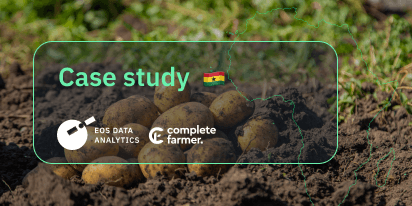
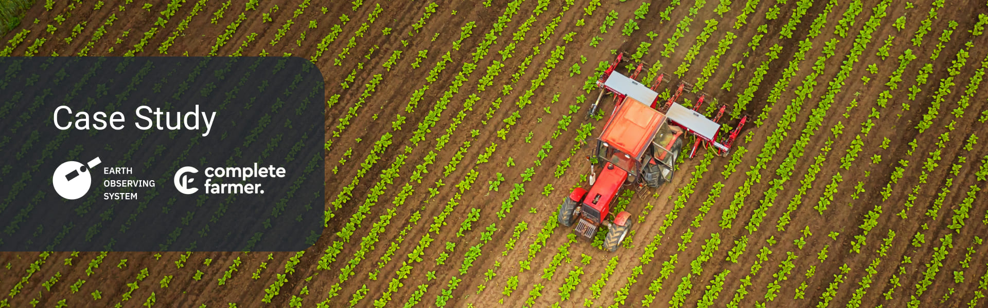
Complete Farmer Connects 5,000+ Farmers To SatTech
Complete Farmer harnesses satellite imagery analytics through the EOSDA Crop Monitoring API, fostering a thriving network of farmers across Africa, leading to remarkable improvements in crop yields.

Space Monitoring For Green Plantains In Rainfall Season
A new triple-impact enterprise in Nicaragua FINCATECH has committed to promoting sustainable digital agriculture by implementing EOSDA Crop Monitoring and turning satellite data analytics into actionable recommendations.
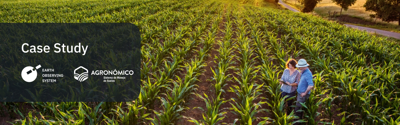
SatTech Plus Ground Data For Agri-Advisors In Portugal
The agritech company helps local growers to adjust crop yield strategies in Portugal, Chile, and Spain by complementing their ground sensors with satellite data analytics from EOSDA Crop Monitoring.
Satellite Analytics For Water Use Efficiency Services
Chilean company Eficagua started using satellite imagery analytics, particularly NDVI analysis of regular and high-resolution imagery of client fields, to make corrections to its precision irrigation program and provide more services.
Top Tools In Our Crop Monitoring Software
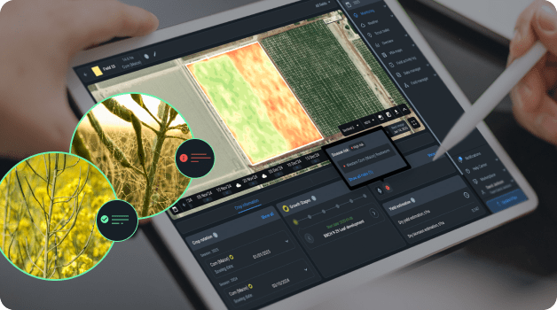
Remote Crop Health Monitoring with Satellites
Track vegetation in multiple areas without being there. Use ready-to-go 10 vegetation indices for smarter decisions. With Sentinel-2 and PlanetScope images, cleared of clouds and shadows, get frequent satellite updates and high accuracy. Monitor crops daily with up to 3m-resolution imagery for quick responses to threats.
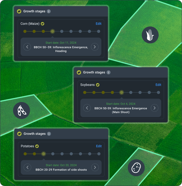
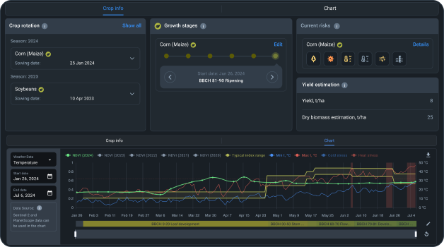
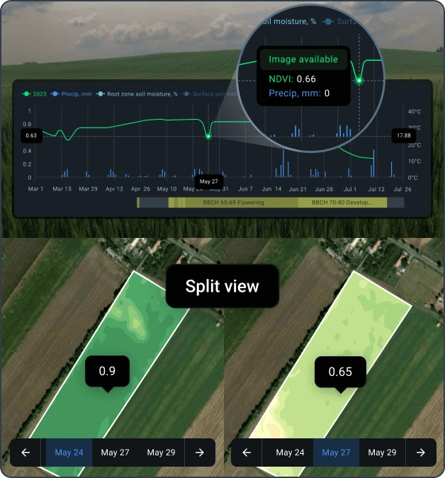
Growth Stages
Plan activities on your fields based on the crop development phase, shown in our Growth stages chart in the remote crop growth monitoring system. Based on the BBCH rate and the date of sowing, the growth stages scale is available for all your crops.
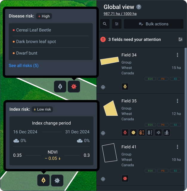
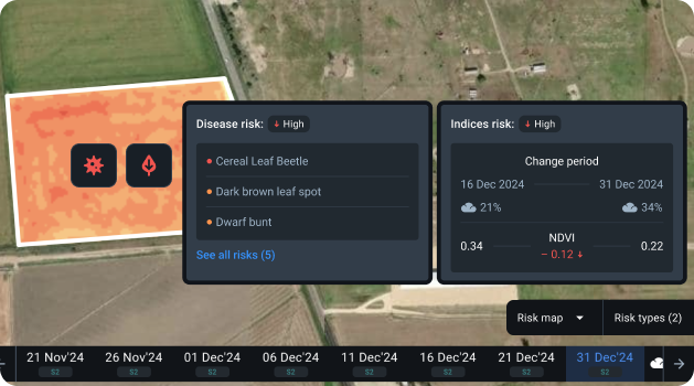
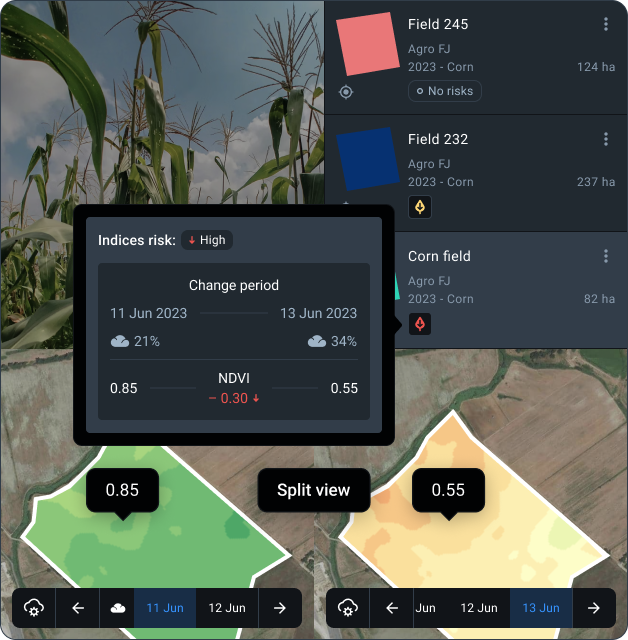
Risk Map
Monitor the risk of diseases, weather, and vegetation indices change in all your fields. Detect potential threats early, prevent outbreaks, and secure yourself from yield loss.
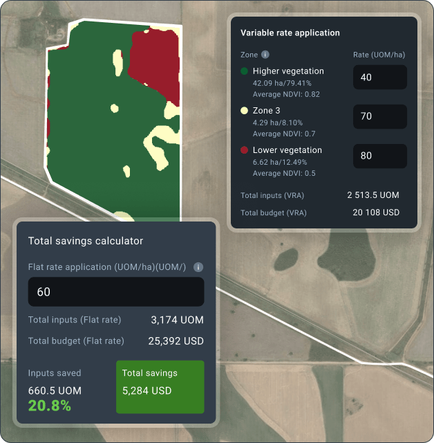
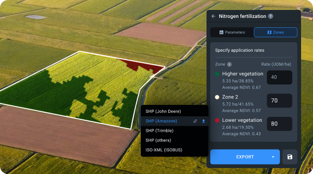
VRA Maps
Increase your profit per hectare and save on fertilizers, pesticides, seeds, and water with variable-rate application maps. Increase precision using different sources of data for VRA maps generation: NDVI, NDMI, RECI, MSAVI, Elevation or ag machinery data. Reduce waste and optimize resources with VRA maps!
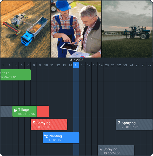
Field Activity Log
Stay ahead of crop issues remotely and track the influence of the activities on land productivity. All the team members have access to data on all of the past and ongoing field activities in one place, including tillage, irrigation, scouting tasks and many more. Using our precision agriculture platform, your team can see all the past and ongoing activities in one place. Plan new tasks, assign them to specific plots, and monitor completion easily on the same screen.
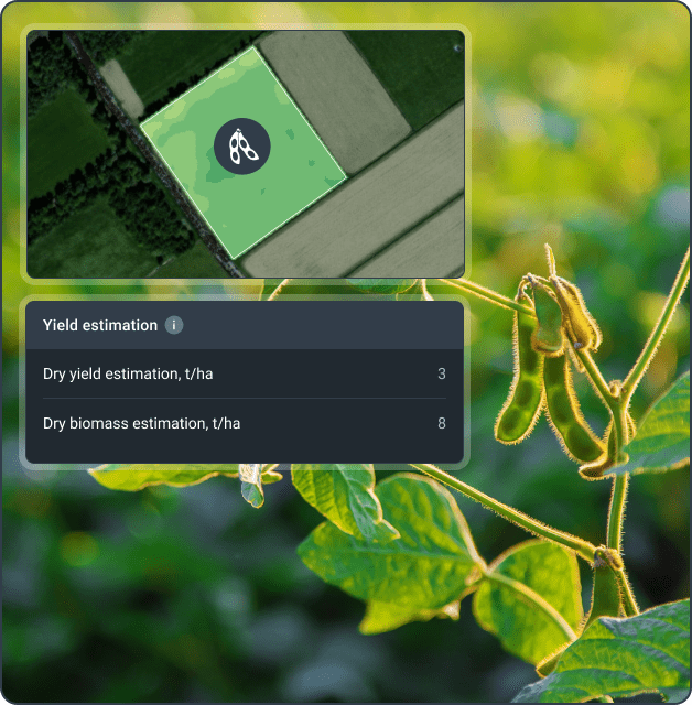
Yield Estimation
Make informed decisions by predicting yield and biomass accurately for the next 14 days. This feature integrates key parameters such as crop type, irrigation method, and meteorological inputs to provide valuable insights into your agricultural operations.
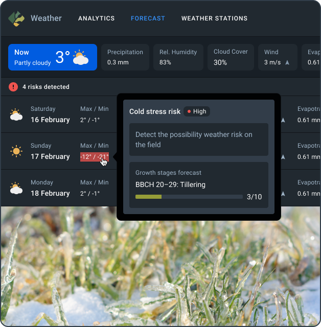
Weather Analytics
Get accurate 14-day forecasts, track historical weather patterns, and monitor cold and heat stress to protect your crops from extreme conditions. Plan the best time for your spraying and tillage operations based on precise weather data. Connect ground weather stations for even more accurate info on your fields.
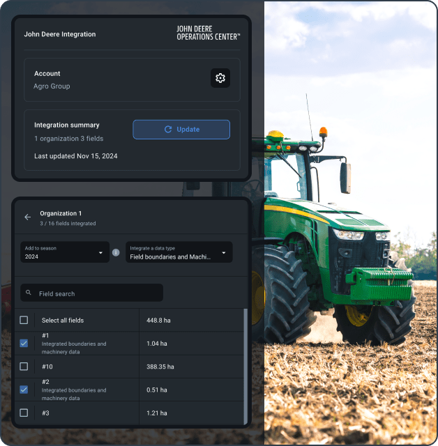
John Deere Integration
Sync your field data and operations automatically from your John Deere Operations Center. Simplify managing plots, boundaries detection, fertilizer application, seeding, spraying, and harvesting.
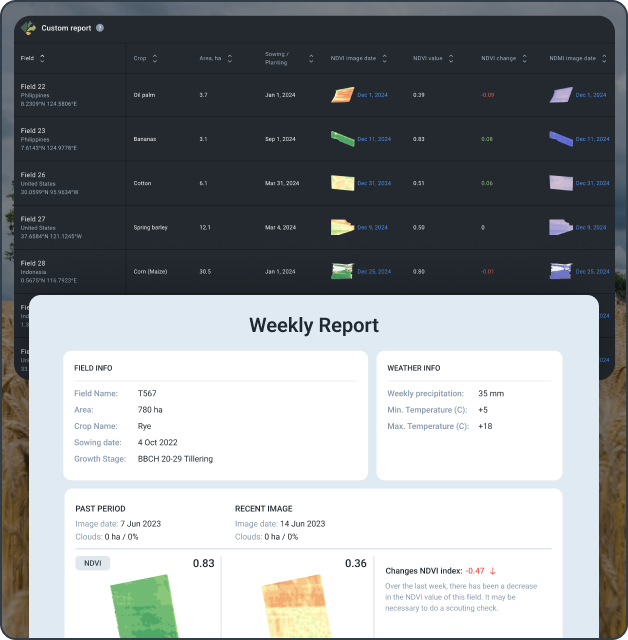
Automated Reports
Get automatic reports on crop performance for one or all your land plots. See overall stats by field operation and crop area. Customize reports with the data you care about most and get updates automatically.
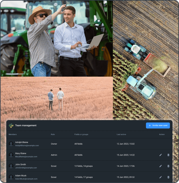
Team Management
Share access with team members based on their roles. Instantly share vegetation insights, field updates, and reports with your team.
What Our Clients Say
Who can benefit from EOSDA Crop Monitoring solutions?
Challenges:
- Data overload without practical insights
- Inaccurate or delayed information
- Limited connectivity in rural areas
- Lack of weather and yield forecasting
- Lack of crop-specific data
- Fertilizers and resources overuse
Our Solution:
- Use vegetation indices and growth stages to monitor plants’ health
- Get automated notifications about risks
- Use VRA maps to optimize resources
- Access weather data: historical and precise forecasts, ground stations
- Manage fieldwork and scouting smartly with our remote crop monitoring solutions
- Enjoy unlimited team accounts
- Combine satellite and machinery data in one platform
Follow the link bellow to learn about the real case
EOSDA Solution Helps Growers Meet Market Demand
Challenges:
- Limited customization for advisory needs
- Challenges analyzing large-scale data
- Lack of teamwork tools for client field management
- Limited predictive tools for insights
- Low client trust in consultant advice
Our Solution:
- Create and share custom reports on crop insights
- Access historical weather and vegetation data
- Use field leaderboard to manage multiple clients' land plots
- Monitor crops remotely across all clients
- Connect advisors and team in one account for efficient collaboration
- Receive predictive risk alerts
- Access satellite and machinery data within one platform
- Use VRA maps for smart resource allocation
Follow the link bellow to learn about the real case
Satellite Monitoring: Trump Card Of Agri ConsultantsWe're Proud To Be Recognized By Leading Industry Organizations

Global enterprise partners