Individual Stand Monitoring
This mode allows you to view more data for a particular stand, including current weather conditions in the area, historical data on the graph below, and notes that you have added previously.
To enter the individual stand monitoring mode, select a particular forest stand from your list and open it. The upper portion of the screen displays your stand on the map in a default layer, while the lower portion of the screen shows you the analytics for the stand. Switch between different layers to view different parameters/features both on the map and on the graph below.
Split View
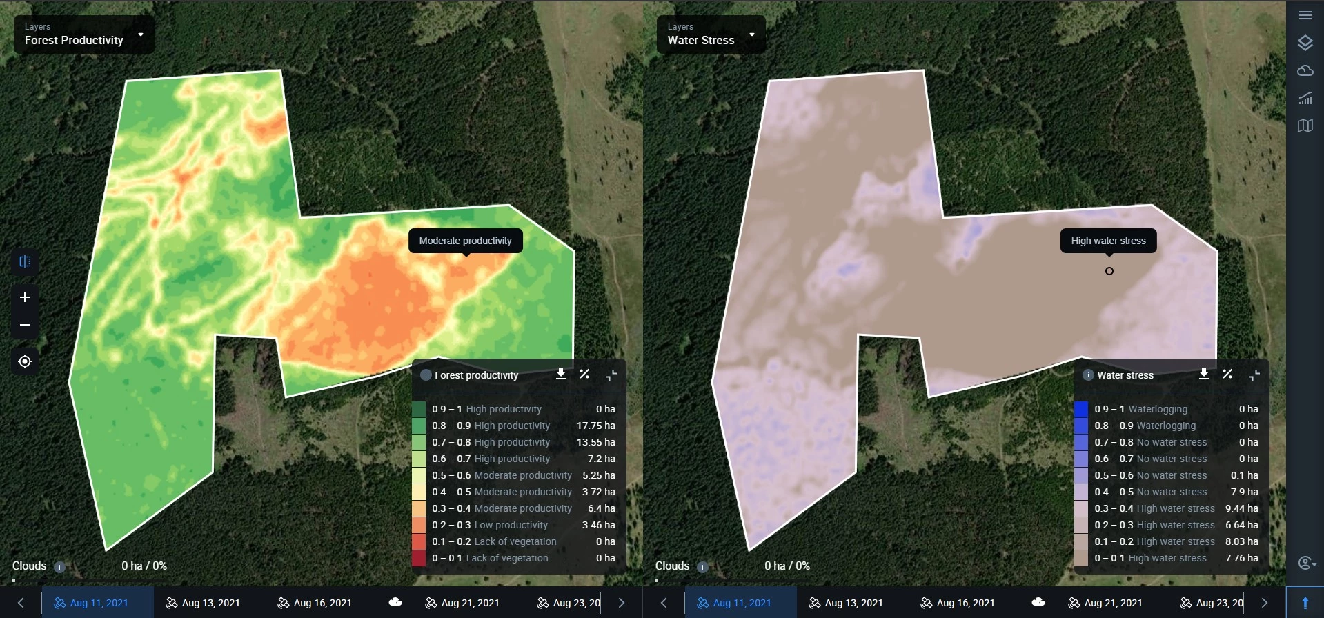
By clicking on this icon, you’ll be able to split the screen into left and right halves to compare different parameters of the same stand.
You can compare different layers for the same date or different dates of the same stand. For example, you can simultaneously view the extent of deforestation and the water levels within the same stand for the same date. Or you can compare the forest cover of the same stand for different dates.
Forest Cover
This layer tells you how much of a stand was covered with the forest at the time of a satellite image. The bright green areas represent the forest cover itself, while the gray area stands for anything that is non-forest.
Note that calculating data can take some time. During this time, the area of the stand will appear orange.
You can alternate between the layer and the true-color satellite image of the stand by clicking on the “show satellite image” icon in the little menu box to the right.
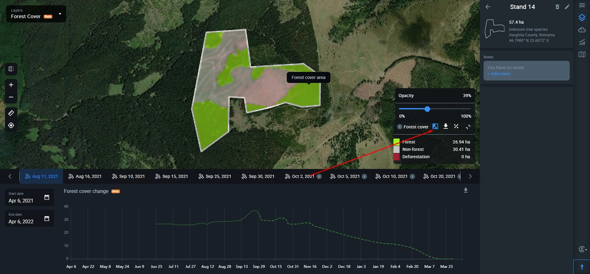
To download the forest layer map of your stand, simply click on the arrow icon.
By clicking the percentage icon, you’ll see how much percent of forest cover area and non-forest area are within the stand.
To hide the menu box, click the “expand” icon.
Important: if the vegetation season for the stand is over, the system will automatically select to display the data based on the last available image before the leaves have fallen. This is done to provide you with the most accurate data.
Deforestation
Switching to this layer, you see the extent of deforestation (logging, natural changes in forest cover, loss of forest cover due to any other cause) for a selected period within your stand in hectares or acres. Deforested areas appear red both on the layer and in the legend, while “other” might stand either for no deforestation or non-forest.
Note that calculating data can take some time. During this time, the area of the stand(s) will appear orange. If there are no available cloudless images for the selected period, the area of the stand(s) will appear blue on the map.
You can choose between three* types of periods to view deforestation:
- Month (from the available cloudless image nearest to the first date of the selected month till the available cloudless image nearest to the first date of the next month);
- Quarter (from the available cloudless image nearest to the first date of the first month in the quarter till the available cloudless image nearest to the first date of the first month in the next quarter);
- Year** (from the available cloudless image nearest to 1 January of the selected year till the available cloudless image nearest to 1 January of the next year).
*To select a custom period, contact our Sales Team
**Since winter occurs not simultaneously for different latitudes, we measure annual deforestation within the growing season of the tree species
To compare the deforestation layer map with the naked-eye image of the stand, click on the “show satellite image” icon.
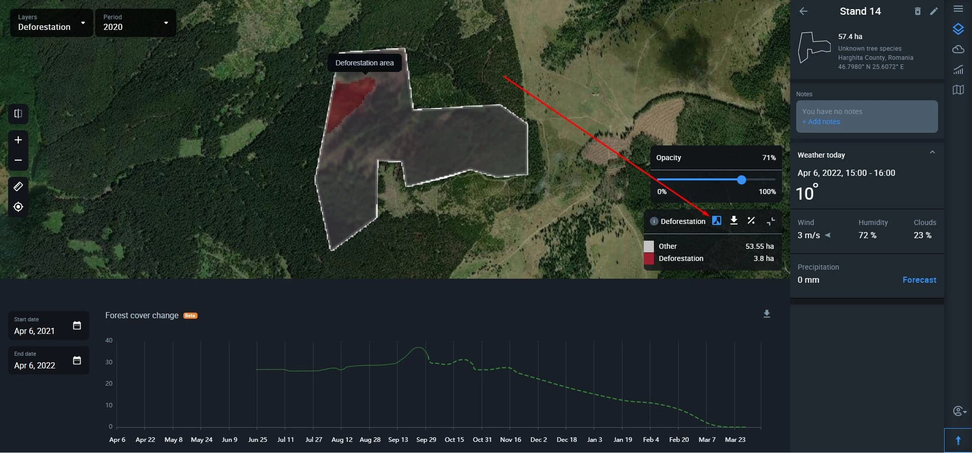
Download the deforestation layer map of your stand by clicking on the arrow icon.
A click on the percentage icon will show you the deforested area percentage relative to the total area of the stand. For example, 2%.
To hide the menu box, click the “expand” icon.
Set up notifications
Once you’ve selected the period to track deforestation, you can set up notifications.
Important: if the vegetation season for the stand is over, the system will automatically select to display the data based on the last available image before the leaves have fallen. This is done to provide you with the most accurate data.
Forest Productivity
Using this layer, you can track any changes in the health of trees within your stand on a regular basis. High productivity indicates healthy trees, while low productivity signals damage due to diseases, natural disasters, pest infestations, human activities, and other causes. Unproductive forest may indicate either a complete absence of vegetation within the stand or recently felled trees.
The graph in the lower portion of the screen shows you the history of this stand’s productivity as a green curve, as well as maximum (red) and minimum (blue) temperatures.
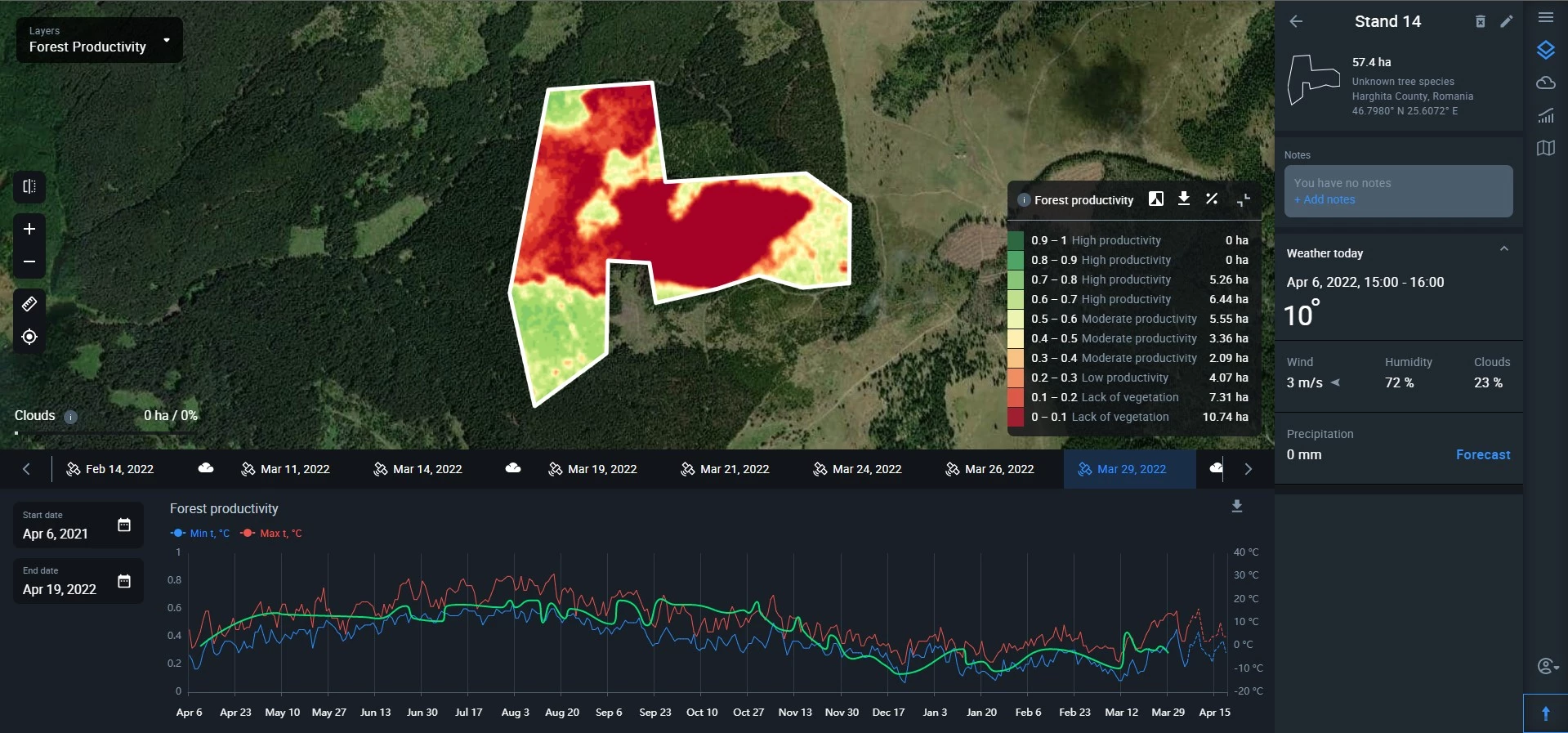
The legend contains detailed information
Tip: Use forest productivity values to measure the effectiveness of forestry operations soon after their completion.
Water Stress
Water stress is calculated as an index with values ranging from 0 to 1 where:
- 0 – 0.4 – high water stress, drought conditions
- 0.4 – 0.8 – no water stress
- 0.8 – 1 – waterlogging
Each value is visually represented by a certain color/hue.
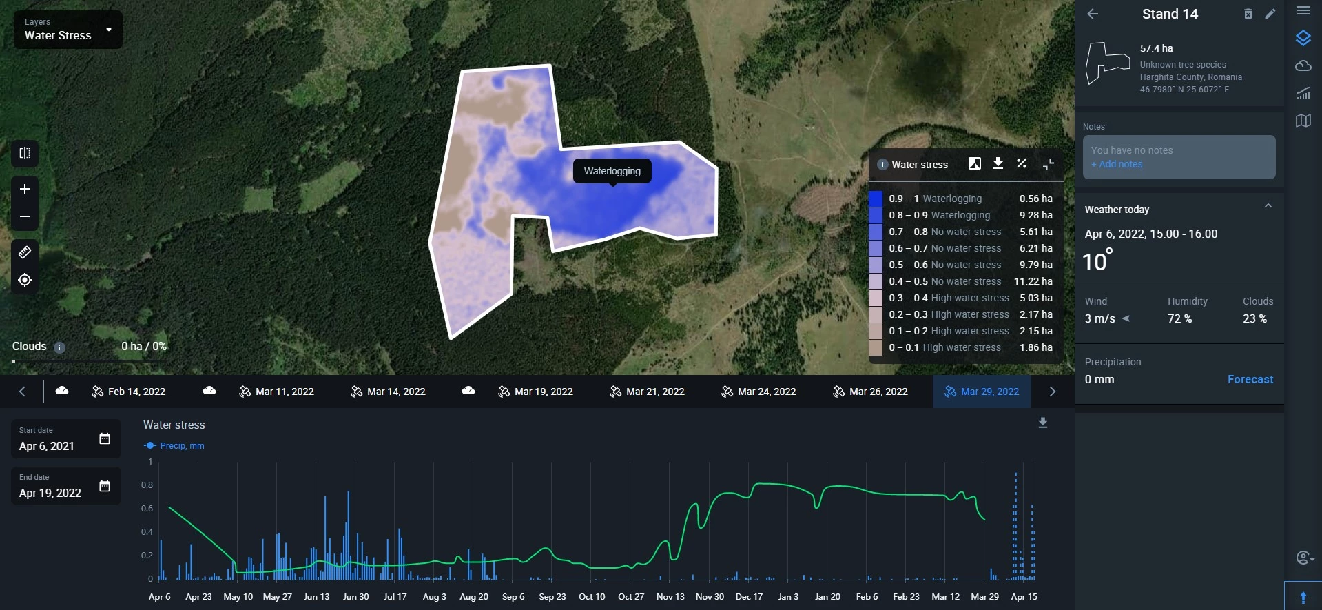
Generally, you want your forest stand to look pink or violet on the map, i.e. having no water stress. Lack of water will make the area appear brown on the map, while an excess of water will look blue.
White color stands for clouds that got into the satellite image of the stand on a particular date.
You can refer to the legend for more details.
Weather Today
This section displays data for several key weather parameters near or within your stand changing in real time. These parameters are:
- Temperature
- Wind speed (m/s or mps)/direction*
- Humidity (%)
- Clouds (%)
- Precipitation (mm/inch)
*wind direction is shown by a little arrow sign next to the speed indication.
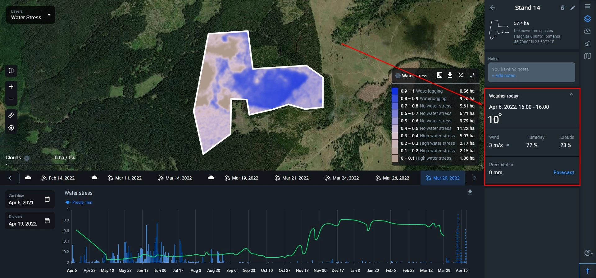
If you need to view a 14-day weather forecast, click on the “forecast” button In the bottom right corner of the section.