Global Monitoring
In this mode, the layers feature allows you to visualize and analyze different data attributes of multiple forest stands at once. Using a drop-down menu in the upper portion of the screen, you can choose between one of the available layers:
- Forest Cover
- Deforestation
- Thermal Anomalies
- Water Stress
- Interactive Map
To view two or more stands in a layer, find one of them using the “Find stand” tool. It is important that these stands are located relatively close to one another, within the same area.
Forest Cover
This layer tells you how much of a stand was covered with the forest at the time of a satellite image. The bright green areas represent the forest cover itself, while the gray area stands for anything that is non-forest.
Note that calculating data can take some time. During this time, the area of the stand(s) will appear orange.
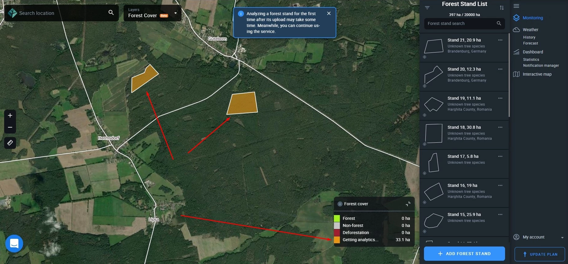
By hovering your mouse over this layer (or double-tapping on a mobile device), you’ll be able to view several parameters at once:
- total area of forest cover in hectares or acres;
- percentage of forest cover relative to the total stand area;
- date when this amount of forest cover was detected/present.
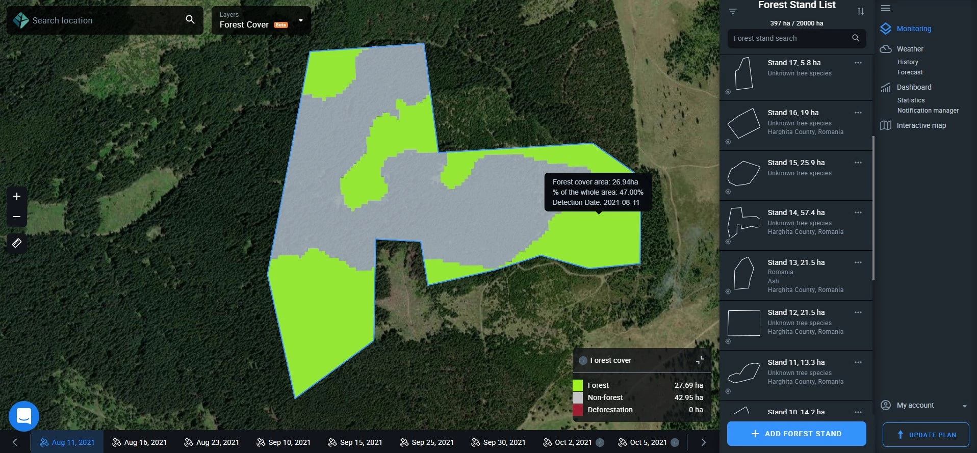
Similarly, hovering or double-tapping over the gray area, you’ll learn the size (ha/ac) and the percentile (%) equivalent of the non-forest part.
For example:
- Forest cover area: 134.19 ha.
- % of the whole area: 72.80%
- Detection date: 26.08.2021
You can also view the hectares/acres of forest cover and no-forest areas in the legend.
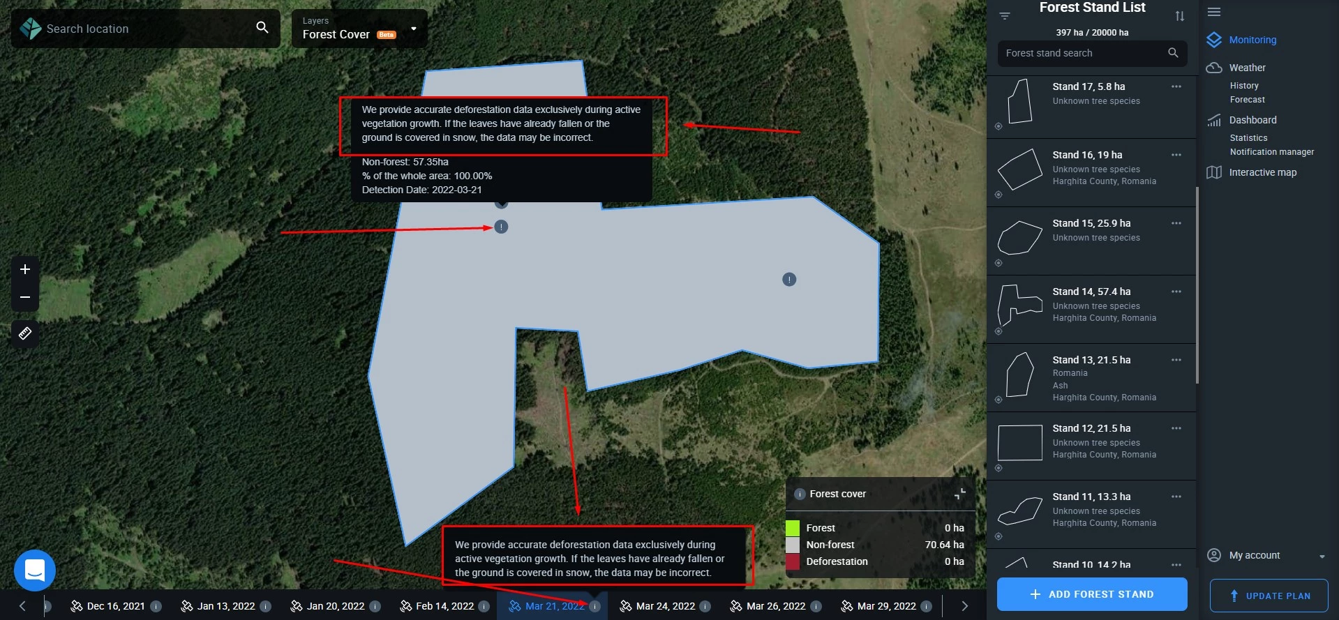
Important: if the vegetation season for the stand(s) is over, the system will automatically select to display the data based on the last available image before the leaves have fallen. This is done to provide you with the most accurate data.
Deforestation
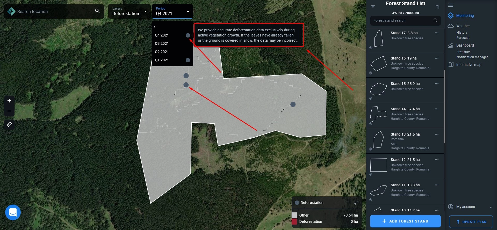
Switching to this layer, you see the extent of deforestation within your stand, measured in hectares or acres (logging, natural changes in forest cover, loss of forest cover due to any other cause) for a selected period. Deforested areas appear red both on the layer and in the legend, while “other” might stand either for no deforestation or non-forest.
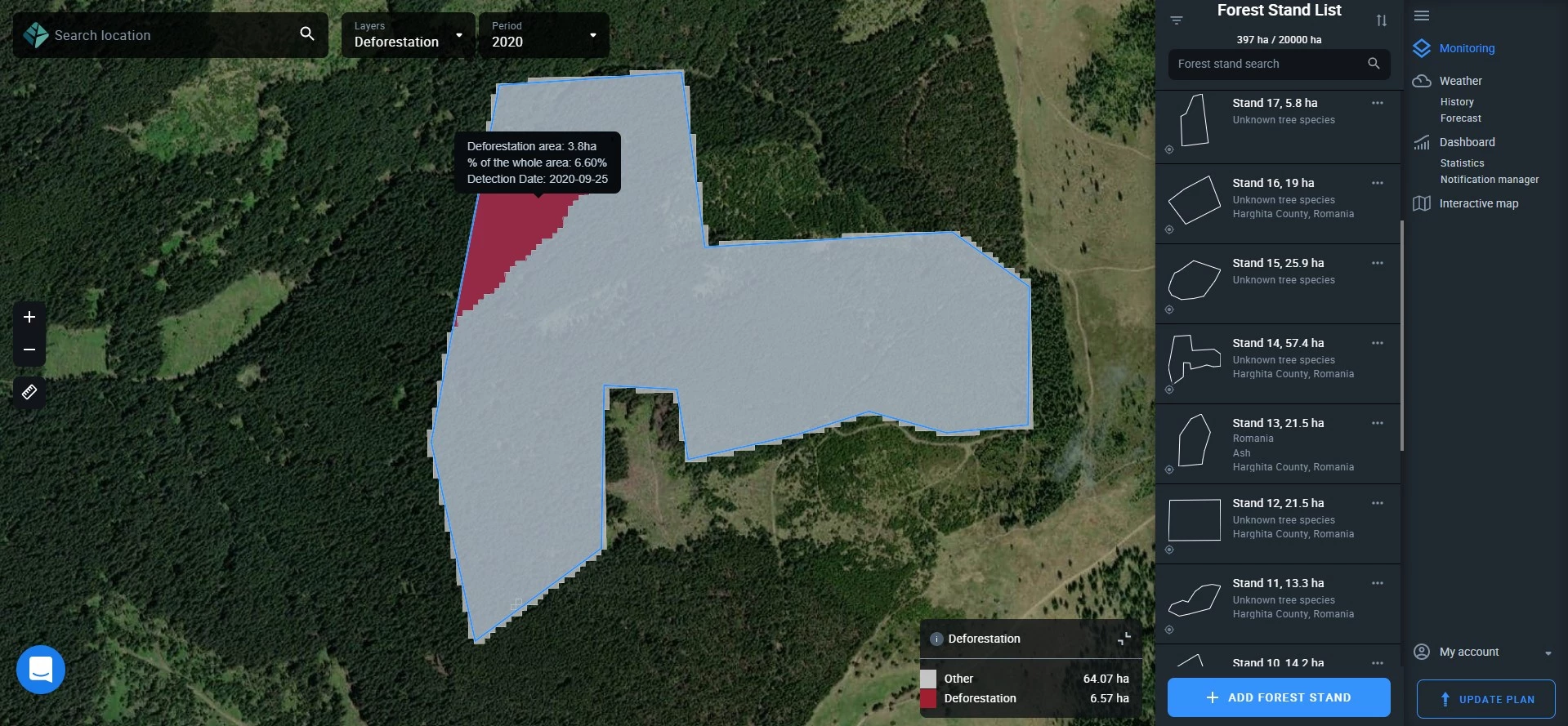
Note that calculating data can take some time. During this time, the area of the stand(s) will appear orange. If there are no available cloudless images for the selected period, the area of the stand(s) will appear blue on the map.
By hovering over or double-tapping (on a mobile device) the red areas, you’ll be able to view the key parameters:
- total deforested area;
- percentage of deforested area relative to the total stand area;
- date when this amount of deforestation was detected.
Similarly, hovering or double-tapping over the gray area, you’ll learn the size (ha/ac) and the percentile (%) equivalent of the no-deforestation/non-forest part.
For example:
Other: 180.5 ha.
% of the whole area: 97.90%
Detection date: 26.08.2021
You can also view the hectares/acres of forest cover and no-forest areas in the legend.
Important: if the vegetation season for the stand(s) is over, the system will automatically select to display the data based on the last available image before the leaves have fallen. This is done to provide you with the most accurate data.
Thermal Anomalies
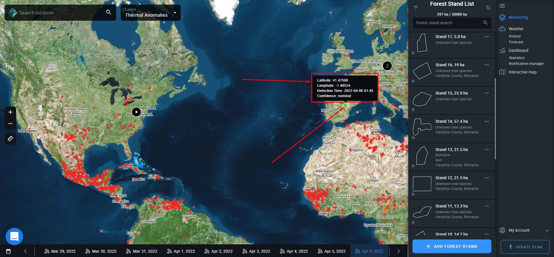
Our global map of heatwaves is based on NASA’s Fire Information for Resource Management System (FIRMS). Every red dot may indicate a potential fire risk, among other things. The map is constantly updated.
Forest Productivity
Using this layer, you can track any changes in the health of trees within your stand on a regular basis. High productivity indicates healthy trees, while low productivity signals damage due to diseases, natural disasters, pest infestations, human activities, end of the vegetation period, and other causes. Unproductive forest may indicate either a complete absence of vegetation within the stand or recently felled trees.
Productivity/health is measured by calculating a vegetation index that ranges from -1 (very poor health) to +1 (healthy). The process is completely automated and ongoing. Values are visualized as color hues ranging from red (-1, unproductive) to green (+1, high productivity), red to orange to yellow to green. There are subranges within the total range: e.g. 0.2 – 0.3 (saturated orange) represent low productivity. This information is contained within the legend.
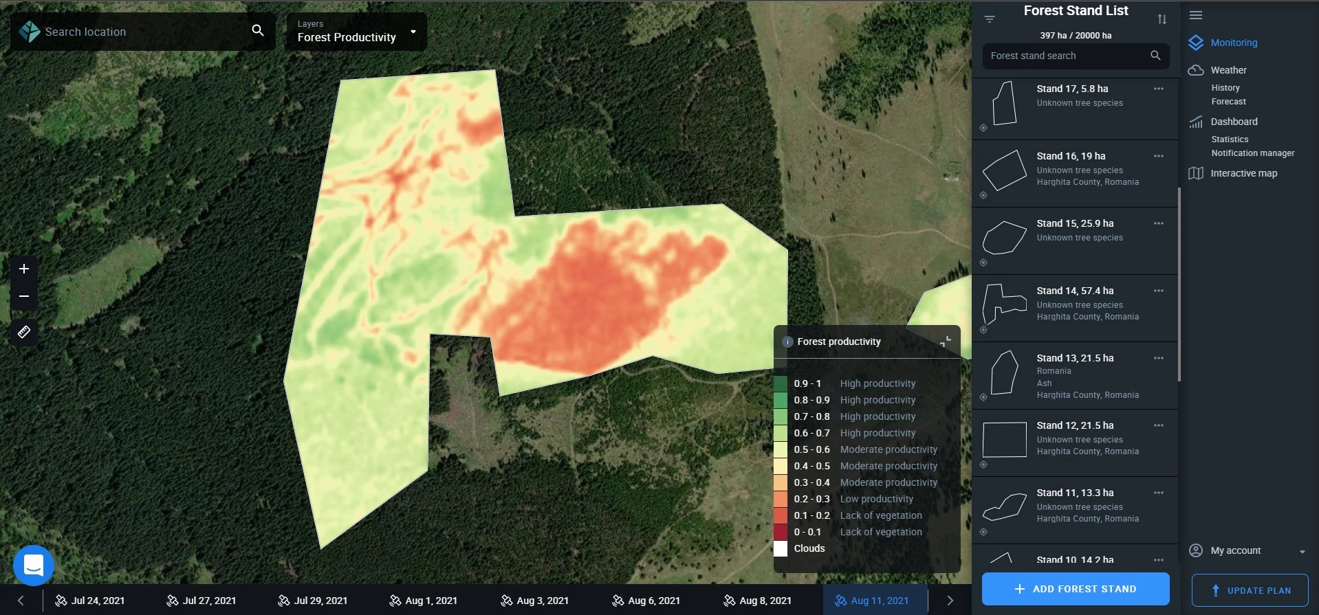
Tip: Use forest productivity values to measure the effectiveness of forestry operations soon after their completion.
Water Stress
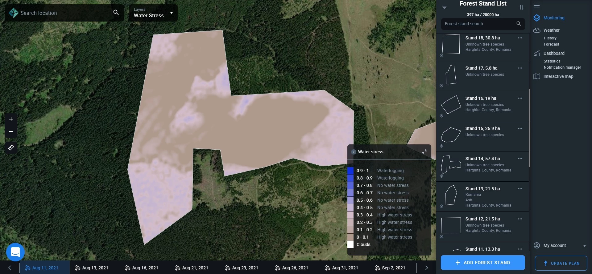
Water stress is calculated as an index ranging from 0 (high water stress, drought conditions) to 1 (waterlogging). Ideal conditions of “no water stress” are represented by the range of 0.4 to 0.8. This range appears as pinkish and violet hues on your map. Brownish hues indicate high water stress related to dry conditions within the stand, and dark bluish hues are indicators of waterlogging. White merely stands for clouds.
The legend tells you exactly how the hues on the map correlate with the values of the water stress index.
